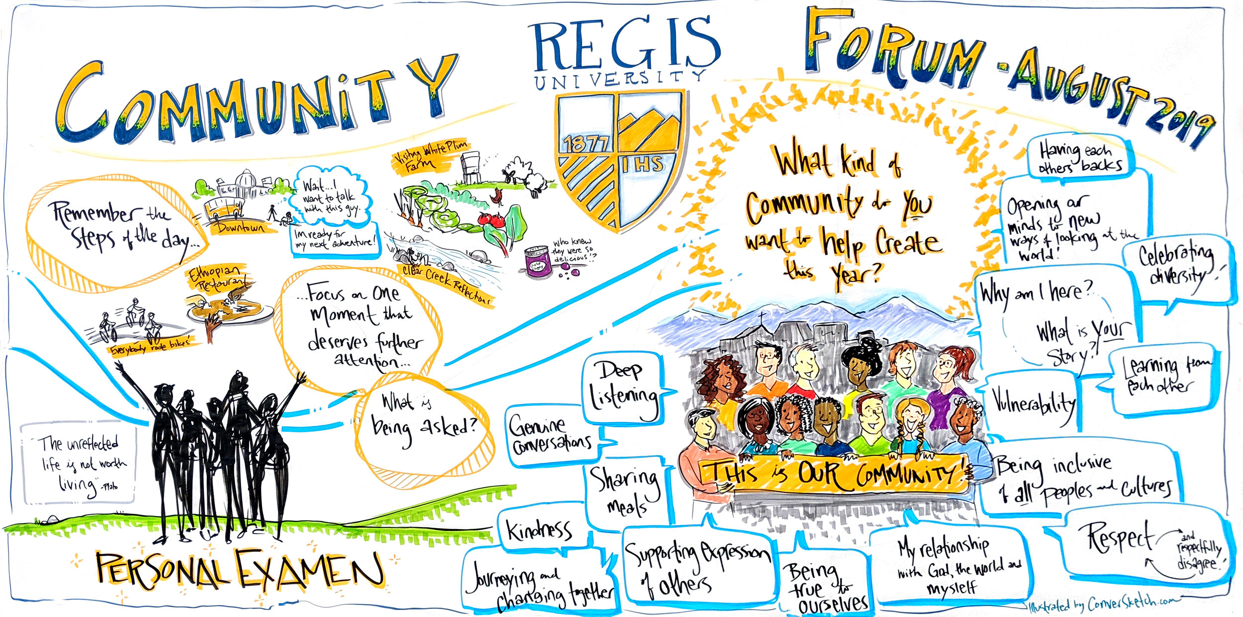
Often graphic recorders come prepared to capture every session in detail. However, sometimes we can be of greater service to the group by producing a single summary illustration of the high-level content of the entire day.
How do you decide which is the best approach for you? Here are a few ideas based on how I’ve partnered with clients to create the best outcomes for their specific needs.
Capturing in more detail is helpful when:
- It’s important to capture many different perspectives and viewpoints to show all voices are heard and/or begin drafting a map of the landscape the group is working in.
- Part of the event will be knowledge downloads, and part of the event will be tapping the wisdom of the room to address a challenge or problem. Having the information presented posted around as charts helps participants build on and remember what was shared as they develop solutions and next steps.
- There are juicy keynotes or panels you want to capture and post as a gallery during and after the event to maintain momentum and inspire action with the group.
- Groups will be taking ideas from plenary and developing them further in breakouts and need details to work with.
One chart for one hour of content from a panel — this was one of many graphics created over the day.
A summary graphic can be more useful if:
- You’ve got concurrent sessions and only one graphic recorder. I often work with clients to design processes for staff or participants to capture key ideas and help me integrate them into the summary.
- There is small group work without reporting back every time.
- You want a slightly more polished piece to share during and after the event in reports, etc.
- The content is sensitive but capturing the overall process and high-level ideas is valuable for participants. Sensing and holding the energy in the room is important for the process. I become part of the container for the group to move through their path, and the graphic summary can also hold that energy.
An example of a two day summary of back-to-back presentations for Houston Methodist Neuroregeneration Summit.
There are many ways to leverage a graphic recorder to best support your group. I love working with my clients leading up to the event to make sure the graphics are tailored to your needs and help move you toward your goals.
And sometimes, this is a “yes, and” situation – it’s important to capture content from each session, then after the event, I’ll work with clients to co-create a visual summary of the key messages to share moving forward.
Have an event coming up? Let’s connect and brainstorm the best ways to leverage visuals for lasting impact and engagement!
Once again, thank you from my heart and soul for your support, great senses of humor, brilliant minds, collaboration and what you're each doing to make the world a better place.
Cheers,
Where in the World is ConverSketch?
Denver, CO: For the closing session of Regis University’s Orientation Forum. New students reflected on a day experiencing different parts of the Denver community, and shared what kind of community THEY wanted to create together over the next year…and beyond!
Washington, DC: With the Democracy Fund to begin creating a systems map of our country’s democracy. It was complex, challenging, thought-provoking, and the hearts and minds of the people in the room are extraordinary! And another example of a summary of content from the entire day.
Newest Watercolor Video is…Heat Illness: Fun for everyone, right? Here’s a video from the National Park Service on how to safely prepare for fun outdoors even in the heat of the summer.


